python 数据可视化实战(1)折线图绘制,
python 数据可视化实战(1)折线图绘制,
本篇博客新开一个数据分析后的数据可视化的例子讲解,每一篇博客是一个例子。
这节课学习如何绘制一个折线图。题目如下:

代码如下:
import matplotlib.pyplot as plt
import matplotlib.font_manager as fm 	# 用于设置中文字体

# 进价与零售价
basePrice, salePrice = 49, 75

# 计算购买num个商品时的单价,买的越多,单价越低
def compute(num):
    return salePrice * (1-0.01*num)

# numbers用来存储顾客购买数量
# earns用来存储商场的盈利情况
# totalConsumption用来存储顾客消费总金额
# saves用来存储顾客节省的总金额
numbers = list(range(1, 31))
earns = []
totalConsumption = []
saves = []
# 根据顾客购买数量计算三组数据
for num in numbers:
    perPrice = compute(num)
    earns.append(round(num*(perPrice-basePrice), 2))
    totalConsumption.append(round(num*perPrice, 2))
    saves.append(round(num*(salePrice-perPrice), 2))

# 绘制商家盈利和顾客节省的折线图,系统自动分配线条颜色
plt.plot(numbers, earns, label='商家盈利')
plt.plot(numbers, totalConsumption, label='顾客总消费')
plt.plot(numbers, saves, label='顾客节省')

# 设置坐标轴标签文本
plt.xlabel('顾客购买数量(件)', fontproperties='simhei')
plt.ylabel('金额(元)', fontproperties='simhei')
# 设置图形标题
plt.title('num-money charts', fontproperties='stkaiti', fontsize=20)

# 创建字体,设置图例
myfont = fm.FontProperties(fname=r'C:\\Windows\\Fonts\\STKAITIl.ttf',
                           size=12)

plt.legend(prop=myfont)

# 计算并标记商家盈利最多的批发数量
maxEarn = max(earns)
bestNumber = numbers[earns.index(maxEarn)]
# 散点图,在相应位置绘制一个红色五角星,详见9.3节
plt.scatter([bestNumber], [maxEarn], marker='*', color='red', s=120)
# 使用annotate()函数在指定位置进行文本标注
plt.annotate(xy=(bestNumber, maxEarn),          # 箭头终点坐标
             xytext=(bestNumber-1, maxEarn+200),# 箭头起点坐标
             s=str(maxEarn),                    # 显示的标注文本
             arrowprops=dict(arrowstyle="->"))  # 箭头样式

# 显示图形
plt.show()
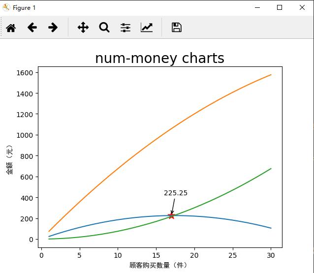
效果如下:
相关内容
- 暂无相关文章
评论关闭