Python图表数据可视化Seaborn:3. 线性关系| 时间线| 热图,,1. 线性关系数据可
Python图表数据可视化Seaborn:3. 线性关系| 时间线| 热图,,1. 线性关系数据可
1. 线性关系数据可视化
lmplot()
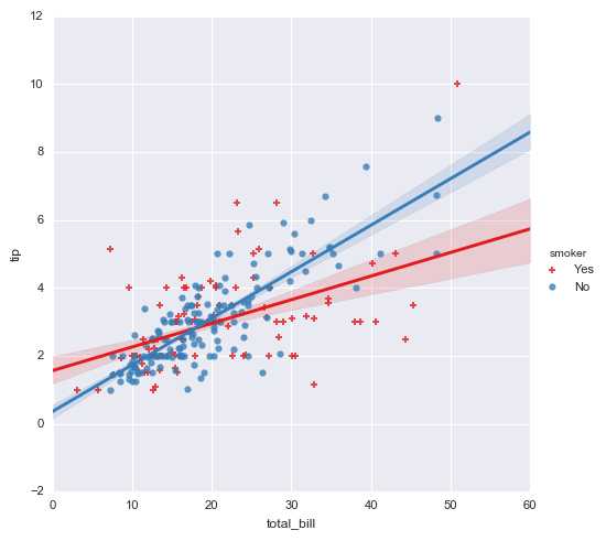
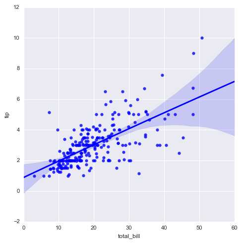
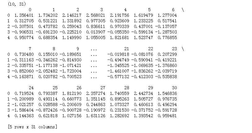
import numpy as npimport pandas as pdimport matplotlib.pyplot as pltimport seaborn as sns% matplotlib inlinesns.set_style("darkgrid")sns.set_context("paper")# 设置风格、尺度import warningswarnings.filterwarnings(‘ignore‘) # 不发出警告# 基本用法tips = sns.load_dataset("tips")print(tips.head())# 加载数据sns.lmplot(x="total_bill", y="tip", hue = ‘smoker‘,data=tips,palette="Set1", ci = 70, # 误差值 size = 5, # 图表大小 markers = [‘+‘,‘o‘], # 点样式 )
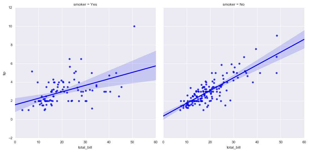
# 拆分多个表格sns.lmplot(x="total_bill", y="tip", col="smoker", data=tips)
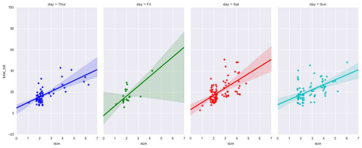
# 多图表1sns.lmplot(x="size", y="total_bill", hue="day", col="day",data=tips, aspect=0.6, # 长宽比 x_jitter=.30, # 给x或者y轴随机增加噪音点 col_wrap=4, # 每行的列数 )
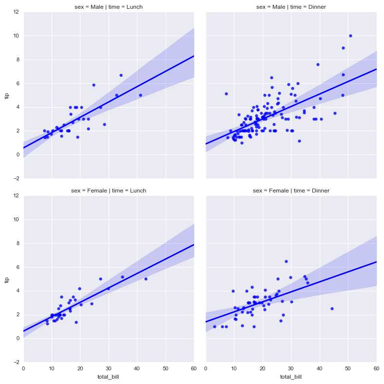
# 多图表2sns.lmplot(x="total_bill", y="tip", row="sex", col="time",data=tips, size=4)# 行为sex字段,列为time字段# x轴total_bill, y轴tip
# 非线性回归sns.lmplot(x="total_bill", y="tip",data=tips, order = 2)
2. 时间线图表、热图
tsplot() / heatmap()
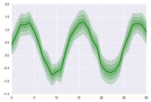
import numpy as npimport pandas as pdimport matplotlib.pyplot as pltimport seaborn as sns% matplotlib inlinesns.set_style("darkgrid")sns.set_context("paper")# 设置风格、尺度import warningswarnings.filterwarnings(‘ignore‘) # 不发出警告# 1、时间线图表 - tsplot()# 简单示例x = np.linspace(0, 15, 31)data = np.sin(x) + np.random.rand(10, 31) + np.random.randn(10, 1)print(data.shape)print(pd.DataFrame(data).head())# 创建数sns.tsplot(data=data, err_style="ci_band", # 误差数据风格,可选:ci_band, ci_bars, boot_traces, boot_kde, unit_traces, unit_points interpolate=True, # 是否连线 ci = [40,70,90], # 设置误差区间 color = ‘g‘ # 设置颜色 )
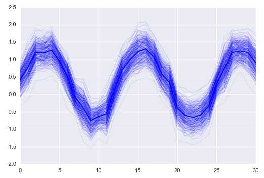
# 1、时间线图表 - tsplot()# 简单示例sns.tsplot(data=data, err_style="boot_traces", n_boot=300 # 迭代次数 )
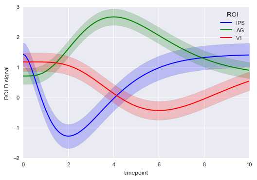
# 1、时间线图表 - tsplot()# 参数设置gammas = sns.load_dataset("gammas")print(gammas.head())print(‘数据量为:%i条‘ % len(gammas))print(‘timepoint为0.0时的数据量为:%i条‘ % len(gammas[gammas[‘timepoint‘] == 0]))print(‘timepoint共有%i个唯一值‘ % len(gammas[‘timepoint‘].value_counts()))# print(gammas[‘timepoint‘].value_counts()) # 查看唯一值具体信息# 导入数据sns.tsplot(time="timepoint", # 时间数据,x轴 value="BOLD signal", # y轴value unit="subject", # condition="ROI", # 分类 data=gammas)# gammas[[‘ROI‘, ‘subject‘]]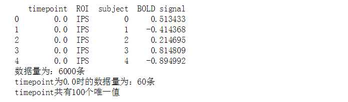
# 2、热图 - heatmap()# 简单示例df = pd.DataFrame(np.random.rand(10,12))# 创建数据 - 10*12图表sns.heatmap(df, # 加载数据 vmin=0, vmax=1 # 设置图例最大最小值 )

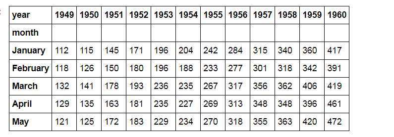
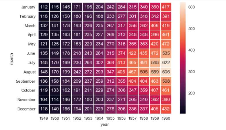
# 2、热图 - heatmap()# 参数设置flights = sns.load_dataset("flights")flights = flights.pivot("month", "year", "passengers") print(flights.head())# 加载数据sns.heatmap(flights, annot = True, # 是否显示数值 fmt = ‘d‘, # 格式化字符串 linewidths = 0.2, # 格子边线宽度 #center = 100, # 调色盘的色彩中心值,若没有指定,则以cmap为主 #cmap = ‘Reds‘, # 设置调色盘 cbar = True, # 是否显示图例色带 #cbar_kws={"orientation": "horizontal"}, # 是否横向显示图例色带 #square = True, # 是否正方形显示图表 )flights.head()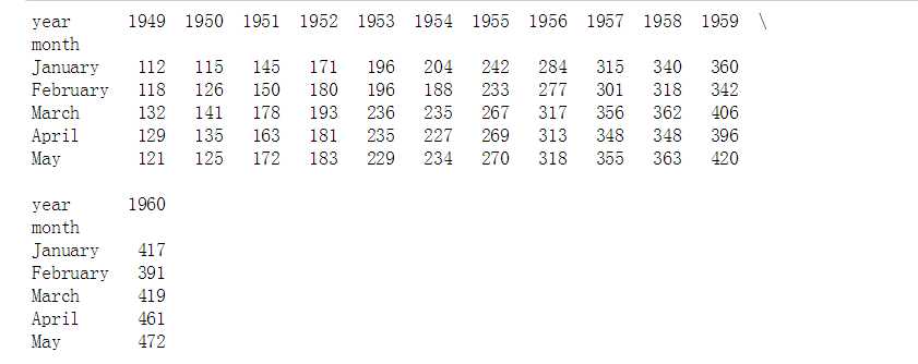
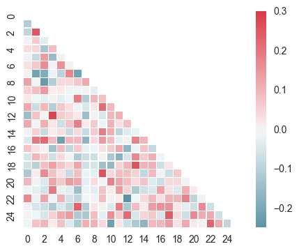
# 2、热图 - heatmap()# 绘制半边热图sns.set(style="white")# 设置风格rs = np.random.RandomState(33)d = pd.DataFrame(rs.normal(size=(100, 26)))corr = d.corr() # 求解相关性矩阵表格# 创建数据mask = np.zeros_like(corr, dtype=np.bool)mask[np.triu_indices_from(mask)] = True# 设置一个“上三角形”蒙版cmap = sns.diverging_palette(220, 10, as_cmap=True)# 设置调色盘sns.heatmap(corr, mask=mask, cmap=cmap, vmax=.3, center=0, square=True, linewidths=0.2)# 生成半边热图
Python图表数据可视化Seaborn:3. 线性关系| 时间线| 热图
评论关闭