用Python做股票市场数据分析—做K线图,python股票市场, 由于本科在校期间
用Python做股票市场数据分析—做K线图,python股票市场, 由于本科在校期间
由于本科在校期间身边有许多朋友是金融专业的,他们时长在我耳边谈起股票情况,受他们影响,耳濡目染地对证券时长有了兴趣。毕业前几个月找实习单位时,又机缘巧合地在这方面工作了一段时间,学习了证券交易的各种理论(道氏理论、日本蜡烛图技术、波浪理论等),虽然后期转行做了本专业工作(数据挖掘),但对证券交易这块一直在关注。闲来无事就用Python来实现了一下蜡烛图,话不多说,直接上代码:
# 导入需要的包和模块import datetimeimport pandas as pdimport tushare as ts # 该模块是一个免费提供股票交易数据的API
# 我们将看看从2016年1月1日开始过去一年的股票价格
start = datetime.date(2016,1,1)
end = datetime.date.today()
# 得到国金证券公司的股票数据;股票代码是600109
# 第一个参数是获取股票数据的股票代码串,第二个参数是开始日期,第三个参数是结束日期
guojin = ts.get_h_data(‘600109‘,str(start),str(end),‘qfq‘)
type(guojin)
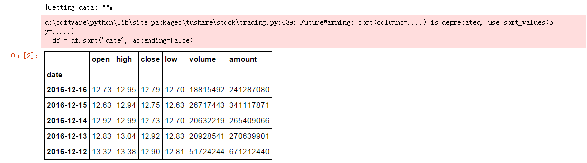
guojin.head()
得到股票数据如下:
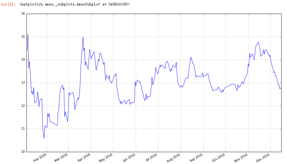
# 可视化股票数据import matplotlib as mlpimport matplotlib.pyplot as plt%matplotlib inline%pylab inline

mlp.rcParams[‘figure.figsize‘] = (15,9)
guojin[‘close‘].plot(grid=True)
得到国金证券2015-2016年的收盘价走势情况:
# 导入画图蜡烛图所需模块from matplotlib.dates import DateFormatterfrom matplotlib.dates import WeekdayLocatorfrom matplotlib.dates import MONDAYfrom matplotlib.dates import DayLocatorfrom matplotlib.finance import candlestick_ohlc# 定义画图函数def pandas_candlestick_ohlc(dat,stick=‘day‘,otherseries=None): """ 参数dat:pandas DataFrame对象采用datetime64指数,和浮点数列 “开盘价”,“最高价”,“收盘价”,“最低价” 参数stick:一个字符串或数字只是的时间段覆盖单一的蜡杆。有效 地字符串输入包括“day”,“week”,“month”,“year”(默认是day) 和任何数字输入,该数字表明一段时间内包括的交易日 参数otherseries:一个可迭代的,它将被强制转换为一个列表,包含dat包 含的其他series将被回执为线条的列 这将显示一个存储在dat中的股票数据的日本蜡烛K线图 """ mondays = WeekdayLocator(MONDAY) # 每周一的主要刻度 alldays = DayLocator() # 每周日的次要此刻度 dayFormatter = DateFormatter("%d") # 创建一个新的DataFrame,包含按色呼入制定的每个阶段的OHLC数据 transdat = dat.loc[:,["open","high","low","close"]] if type(stick) == str: if stick == "day": plotdat = transdat stick = 1 elif stick in [‘week‘,‘month‘,‘year‘]: if stick == ‘week‘: transdat[‘week‘] = pd.to_datetime(transdat.index).map( lambda x: x.isocalendar()[1]) #确定周 elif stick == ‘month‘: transdat[‘month‘] = pd.to_datetime(transdat.index).map( lambda x: x.month) # 确定月 transdat[‘year‘] = pd.to_datetime(transdat.index).map( lambda x: x.isocalendar()[0]) # 确定年 # 按年和其他适当变量分组 grouped = transdat.groupby(list(set([‘year‘,stick]))) # 创建将要包含绘图的空数据框 plotdat = pd.DataFrame({"open":[],"high":[],"low":[],"close":[]}) for name, group in grouped: plotdat = plotdat.append(pd.DataFrame({"open":group.iloc[0,0], "high":max(group.high), "low":min(group.low), "close":group.iloc[-1,3]}, index = [group.index[0]])) if stick == "weed": stick = 5 elif stick == "month": stick = 30 elif stick == "year": stick = 365 elif type(stick) == int and stick >=1: transdat["stick"] = [np.float(i/stick) for i in range(len(transdat.index))] grouped = transdat.groupby("stick") # 创建将要包含绘图的空数据框 plotdat = pd.DataFrame({"open":[],"high":[],"low":[],"close":[]}) grouped = transdat.groupby(‘stick‘) for name,group in grouped: plotdat = plotdat.append(pd.DataFrame({"open": group.iloc[0,0], "high": max(group.high), "low": min(group.low), "close": group.iloc[-1,3]}, index = [group.index[0]])) else: raise ValueError(‘Valid inputs to argument "stick" include the strings "day","week","month","year",or a positive integer‘) # 设置plot参数,包括用绘制的轴线对象ax fig, ax = plt.subplots() fig.subplots_adjust(bottom=0.2) if plotdat.index[-1] - plotdat.index[0] < pd.Timedelta(‘730 days‘): weekFormatter = DateFormatter("%b %d") # 例如,1月12 ax.xaxis.set_major_locator(mondays) ax.xaxis.set_minor_locator(alldays) else: weekFormatter = DateFormatter("%b %d,%Y") ax.xaxis.set_major_formatter(weekFormatter) ax.grid(True) # 创建K线图 candlestick_ohlc(ax,list(zip(list(date2num(plotdat.index.tolist())), plotdat["open"].tolist(), plotdat["high"].tolist(), plotdat["low"].tolist(), plotdat["close"].tolist())), colorup = "black",colordown=‘red‘) # 绘制其他series(如移动平均线)作为线 if otherseries != None: if type(otherseries) != list: otherseries = [otherseries] dat.loc[:,otherseries].plot(ax=ax,lw=1.3,grid=True) ax.xaxis_date() ax.autoscale_view() plt.setp(plt.gca().get_xticklabels(),rotation=45, horizontalalignment=‘right‘) plt.show()下面调用该函数,输出结果:
pandas_candlestick_ohlc(guojin)
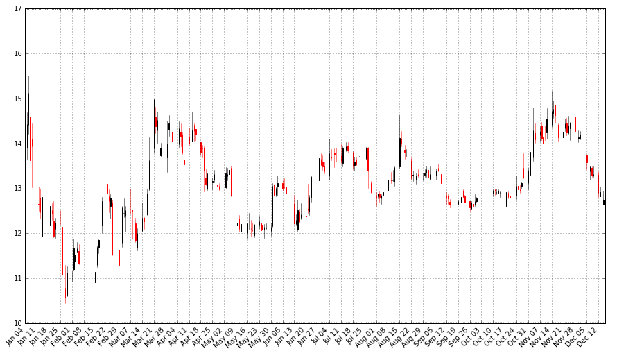
该图看起来和商用交易软件显示结果差不多,但还是存在些问题,如图像中对于未开盘日期K线不连续,不能缩放等,后期继续加以改进。
用Python做股票市场数据分析—做K线图
相关内容
- python padas 学习,pythonpadas,import mat
- wiki中文语料+word2vec (python3.5 windows win7),word2vecwin7,环境
- Python中where()函数的用法,pythonwhere,where()的用法
- Python3-递归函数,python3-递归,什么是递归?递归,就
- python *与**,python,python中,在形
- Python使用zip合并相邻列表项的方法示例,python列表项
- python中format()函数的简单使用教程,pythonformat
- python如何压缩新文件到已有ZIP文件,python压缩已有zip
- Python callable()函数用法实例分析,pythoncallable
- Python iter()函数用法实例分析,pythoniter
评论关闭