Python第三方库之openpyxl(4),,Python第三方库
Python第三方库之openpyxl(4),,Python第三方库
Python第三方库之openpyxl(4)
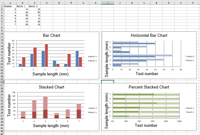
2D柱状图
在柱状图中,值被绘制成水平条或竖列。
垂直、水平和堆叠柱状图。
注意:以下设置影响不同的图表类型
1.在垂直和水平条形图之间切换,分别设置为col或bar
2.当使用堆叠图表时,overlap需要设置为100
3.如果条是水平的,x轴和y轴要反转
from openpyxl import Workbookfrom openpyxl.chart import BarChart, Series, Referencewb = Workbook(write_only=True)ws = wb.create_sheet()rows = [ (‘Number‘, ‘Batch 1‘, ‘Batch 2‘), (2, 10, 30), (3, 40, 60), (4, 50, 70), (5, 20, 10), (6, 10, 40), (7, 50, 30),]for row in rows: ws.append(row)chart1 = BarChart()chart1.type = "col"chart1.style = 10chart1.title = "Bar Chart"chart1.y_axis.title = ‘Test number‘chart1.x_axis.title = ‘Sample length (mm)‘data = Reference(ws, min_col=2, min_row=1, max_row=7, max_col=3)cats = Reference(ws, min_col=1, min_row=2, max_row=7)chart1.add_data(data, titles_from_data=True)chart1.set_categories(cats)chart1.shape = 4ws.add_chart(chart1, "A10")from copy import deepcopychart2 = deepcopy(chart1)chart2.style = 11chart2.type = "bar"chart2.title = "Horizontal Bar Chart"ws.add_chart(chart2, "G10")chart3 = deepcopy(chart1)chart3.type = "col"chart3.style = 12chart3.grouping = "stacked"chart3.overlap = 100chart3.title = ‘Stacked Chart‘ws.add_chart(chart3, "A27")chart4 = deepcopy(chart1)chart4.type = "bar"chart4.style = 13chart4.grouping = "percentStacked"chart4.overlap = 100chart4.title = ‘Percent Stacked Chart‘ws.add_chart(chart4, "G27")wb.save("bar.xlsx")运行结果
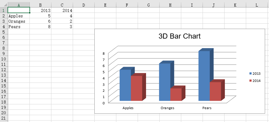
3D柱状图
from openpyxl import Workbookfrom openpyxl.chart import ( Reference, Series, BarChart3D,)wb = Workbook()ws = wb.activerows = [ (None, 2013, 2014), ("Apples", 5, 4), ("Oranges", 6, 2), ("Pears", 8, 3)]for row in rows: ws.append(row)data = Reference(ws, min_col=2, min_row=1, max_col=3, max_row=4)titles = Reference(ws, min_col=1, min_row=2, max_row=4)chart = BarChart3D()chart.title = "3D Bar Chart"chart.add_data(data=data, titles_from_data=True)chart.set_categories(titles)ws.add_chart(chart, "E5")wb.save("bar3d.xlsx")运行结果
Python第三方库之openpyxl(4)
相关内容
- python第三方库 - dateurtil,,简介 扩展并增强
- Python 安装pytz,,1. https:/
- Appium+Python之PO模型(Page object Model),,思考:我们进行
- python 爬虫学习--Beautiful Soup插件,,Beautiful
- python学习--javascript,,https://ww
- linux添加PYTHONPATH环境变量,,1、添加环境变量到p
- python-flask-scoped_session创建session的两种方式,,scoped_ses
- python学习 -- operator.itemgetter(), list.sort/sorted 以及lambda函
- python中的easydict模块使用,,from easyd
- Python pdfkit,,序言python使用
评论关闭