python使用技巧 五matplotlib,,一、折线图impor
python使用技巧 五matplotlib,,一、折线图impor
一、折线图
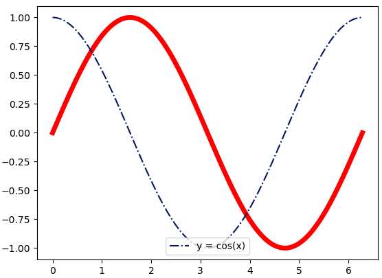
import numpy as npimport matplotlib.pyplot as pltx = np.linspace(0, 2 * np.pi, 100)y1, y2 = np.sin(x), np.cos(x)plt.plot(x, y1, c=‘r‘, ls=‘-‘, lw=5)plt.plot(x, y2, c=‘#021962‘, ls=‘-.‘, label=‘y = cos(x)‘)plt.legend(loc=‘lower center‘)plt.show()
1)np. linspace(0, 2* np.pi, 100) 返回类型是<class ‘numpy.ndarray‘>,从0到6.28的list。
2)label=‘ ‘和plt. legend()一起使用,用plt.xlabel(‘y=cos(x)‘)代替也行。
3)c=‘r‘ 表示①color=‘red‘;②还可以#rrggbb; ③(r, g, b) 或 (r, g, b, a) 其中 r g b a 取均为[0, 1]之间。
4)ls即linestyle表示线的样式,取值 - solid、 -- dashed、 : dotted、 ‘‘ None、 -. dashdot。
5)plt.legend()的loc指位置,取值0 best、 1 upper right、 5 right、 6 center left、 10 center
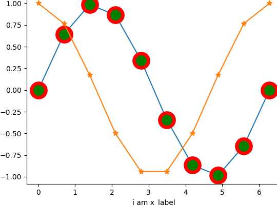
6)线结点的样式
关键字mecmarkeredgecolor、 mewmarkeredgewidth、 mfcmarkerfacecolor、 mfcaltmarkerfacecoloralt 、 ms markersize
关键字取值:https://www.cnblogs.com/onemorepoint/p/7482644.html 试试:
plt.plot(x, y1, marker=‘o‘, mec=‘r‘, mfc=‘g‘,ms=20,mew=5)plt.plot(x, y2, marker=‘*‘, ms=8)plt.xlabel("i am x_label")二、柱状图
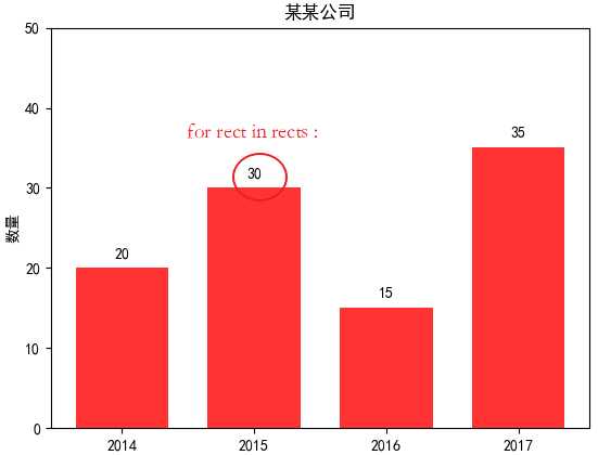
import matplotlib.pyplot as pltimport matplotlib # 引入matplotlib.rcParams[‘font.sans-serif‘] = [‘SimHei‘] # 中文设置x_label = [‘2014‘, ‘2015‘, ‘2016‘, ‘2017‘] bar_heights = [20, 30, 15, 35] rects = plt.bar(range(len(bar_heights)), height=bar_heights, width=0.9, alpha=0.8, color=‘red‘, label="一部门")plt.ylim(0, 50) plt.ylabel("数量")plt.title("某某公司")plt.xticks(range(len(bar_heights)), x_label)plt.show() # 显示1)每一条柱占据一个单位宽,但显示的位置与宽度由plt. bar决定。
2)range(len(bar_heights))即[0, 1, 2, 3],表示每一个条柱左下端点的位置,右下端点的位置需要在根据width得出。
3)plt.xticks例子中[0, 1, 2, 3],但x_label显示在0.5, 1.5, 2.5, 3.5刻度处。
4)plt. ylim(0, 50)表示y轴的取值范围。
for rect in rects: # 在每个条柱上标明 height = rect.get_height() plt.text(rect.get_x() + rect.get_width() / 2, height+1, str(height), ha="center", va="bottom")
三、散点图 参见https://www.cnblogs.com/sunshinewang/p/6853813.html
import numpy as npimport matplotlib.pyplot as pltN = 1000x = np.random.randn(N)y = np.random.randn(N)plt.scatter(x, y)plt.show()
scatter()函数主要参数
scatter(x, y, s=None, c=None, marker=None, edgecolors=None,alpha=None,linewidths=None)
1) s即size,点的大小面积,默认是20
2) c即color,点的颜色,默认蓝色
3) mark 点的形状,默认是圆
plt.rcParams[‘font.sans-serif‘]=[‘SimHei‘] # 用来正常显示中文标签plt.rcParams[‘axes.unicode_minus‘]=False # 用来正常显示负号
四、饼状图 参见https://www.cnblogs.com/zsr0401/p/6405538.html
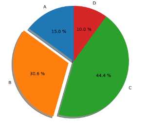
import matplotlib.pyplot as pltlabels = ‘A‘, ‘B‘, ‘C‘, ‘D‘datas = [15, 30.55, 44.44, 10]explode = [0, 0.1, 0, 0] # 0.1 凸出这部分,plt.axes(aspect=1) # set this , Figure is round, otherwise it is an ellipseplt.pie(x=datas, labels=labels, explode=explode, autopct=‘%3.1f %%‘, shadow=True, labeldistance=1.1, startangle=90, pctdistance=0.6 )plt.show()
labeldistance      文本的位置离远点有多远,1.1指1.1倍半径的位置
autopct         圆里面的文本格式,%3.1f%%表示小数有三位,整数有一位的浮点数
shadow        饼是否有阴影
startangle     起始角度,0,表示从0开始逆时针转,为第一块。一般选择从90度开始比较好看
pctdistance     百分比的text离圆心的距离
patches, l_texts, p_texts 为了得到饼图的返回值,p_texts饼图内部文本的,l_texts饼图外label的文本
2020-03-04 21:51:46
python使用技巧 五matplotlib
相关内容
- Python数据结构之----数据存储与深浅拷贝,, 要深入
- 基于python语言的tensorflow的‘端到端’的字符型验证码识
- 如何在MacOS的VScode上安装Python3,,由于MacOS上的V
- python查询MySQL数据库的表以及所有字段,,#!/usr/bin
- Python3 print不输出回车符,,Python3 pr
- 用python对股票期货做时序分析,,CFFEX.IF18
- Python 高级变量类型 --- 元组,,元组1,元组的定义T
- python中的numpy常用方法,,numpy是用于处理
- 一些Python爬虫工具,,爬虫可以简单分为三步
- linux重新安装python,,第一步:下载pyth
评论关闭